Table of contents
| Table of Contents | ||
|---|---|---|
|
Browsing the front-office
...
As a shop owner, you should know your front-office like the back of your hand, not only because you owe it to yourself to know your shop in inside and out, but also because you need to understand what your customers face, the number of pages and clicks they go through during a typical buying sessions, where they might get stuck and how to help them out, etc.
...
PrestaShop comes with a default theme, which uses shades of gray on a white background. This simple design was purposefully done intentional, in order to be adaptable to just about any line of business: cars, photographs, antiques... anything, or anything at all! It was designed to be easy to browse, ergonomic and standard-compliant. It is complete, has been heavily tested by thousands of shops, and has proven its value.
If you installed PrestaShop with its sample data, you will see Apple products.
While the shop owner can change the front-office theme at any time anytime, thanks to the wealth of themes that are available on the PrestaShop Addons website, we will base this chapter on the default theme only.
Note that we here are describing the default theme with its default settings and modules. Activating other modules , or obviously using another theme , can dramatically change the shopping experience.
Navigating the shop
Whether he your customer arrives on the front page by typing the shop web addresses or lands on a sub-page through a search engine, the customer he or she will always have many options to navigate through the catalog.
The header

The header is a thin bar of content, accessible from any of the front-office pages. It contains some essential several tools and links, which apply to the whole shop:
- The shop's logo. A click on Clocking the logo brings the customer back to the front page, from anywhere in the shop.
- The currency block. The customer can choose the currency in which the shop should display appsprices. This is great in order to compare prices with other international shopsfor comparing prices in foreign currencies.
- Contact and Sitemap. These two links take the customer to specific pages, out of the shopping context: contacting the shop administrators, or viewing a complete list of all the pages that are publicly accessible.
- Bookmark. This is not a link per se, but a JavaScript action: when clicked, it will trigger prompt the customer's browser to add the shop as a bookmark. The customer can then choose to complete the action or not.
- The search engine. Many customers prefer to look for a specific item through the search engine rather than browsing through categories after categories of products. On some online shopshops, this is even actually the only preferred way to browser browse the site's content for most customers.
- Welcome, XXX. An invitation for the customer to connect to the shop by entering their credentials. If connected, this will display "Welcome, (firstname)".
- "Your account". A link to the user's account, or if not connected, to the authentication/registration page.
- "Cart: (empty)*. A quick reminder of the current status of the customer's cart. Sometimes customers select items while browsing and forget about them after a few pages. It is therefore essential to give them a way to keep these products in mind.
The header hardly ever changes throughout the whole buying experienceThis header will be consistent across the entire purchasing experience unless custom changes are applied.
The footer
![]()
The footer gives access to some of the interesting page pages that could be useful to a user who haven't found anything interesting to him, and thus has scrolled to the bottom of the screenyour users.
- Three links to products product lists:
- Specials: all the current promotions.
- New products: recently added items.
- Top sellers: most popular items.
- Four links to informational pages:
- Our stores
- Contact us
- Terms and Conditions
- Privacy policy
- Right of withdrawal
- About us
Note that all these These links can all be changed by the shop owner: they are CMS pages.
The left column
The default theme's left column doesn't change much duringstays primarily static, as it mainly serves as a handy placeholder for navigation and secondary links:
- (if logged in) "My account" block, with links to the customer's account pages.
- three Three of the default blocks help the user navigate the shop and filter content: tags, categories and manufacturers are the most common ways by which shoppers look for a given product.
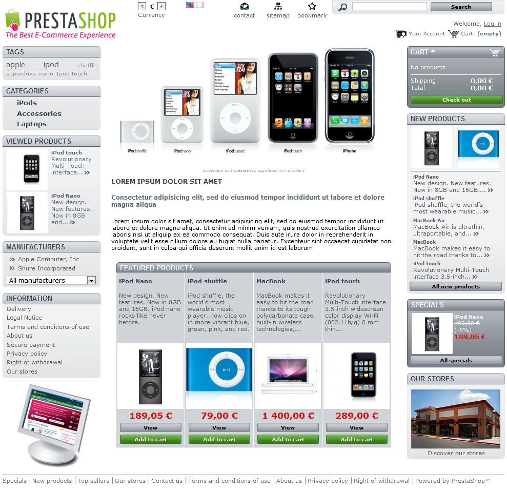
- "Viewed products" serves as a reminder of the products previously took interest in, and gives a shortcut back to these if he wants to pick them in the end.
- Finally, "Information" is where PrestaShop lists the default static pages, as written by the shop owner: delivery information, legal notices, T&C... They are not selling points, but their content is important enough that it warrants being always available.
"My account" block
Once the customer is logged in, the "My account" block appears in the left column. Its sole purpose is to give a the customer quick access to all the his or her personal pages for this customer:
- My orders. All past and currently processing orders.
- My credit slips. Received when an order has been canceled, credit slips can be used for any future order.
- My addresses. A customer can have many addresses, if only for having a product delivered to a friend's house, for instanceadd multiple addresses for different delivery options.
- My personal info. First name, last name, e-mail address, home address, phone number, date of birth: all the necessary information about a the customer.
- My vouchers. All coupons code that have not yet been used.
All in all, this block is a replication of the content of This block provides the same content as the "My account" page, which can be accessed from the eponymous link at on the right of the header.
Tags
The shop owner can indicate a set of tags for each product. A tag is a non-hierarchical keyword, also described as metadata: it is not displayed on the product page as it does not bring any useful information, but it can prove very useful when building thematic lists – such as a tag-cloud, where the most common tags are written in a bigger font than the rarer ones.
Categories
A category is a hierarchical way of sorting items: a category it can contain any number of sub-categories, this making it possible to easily browse from the more general items category listings to the more specific ones products by following a logical path.
A PrestaShop shop can have as many levels of categories and sub-categories as needed, as well as with an infinite number of categories and products in a given category level. All categories are in fact actually sub-categories of the root category, the "Home." one.
This is also the only product list view were where the customer can compare products , by ticking their checkbox and validating his choice using selecting the "Compare" button.
...
Viewed Products
The shop owner can indicate a set of tags for each product. A tag is a non-hierarchical keyword, also described as metadata: it is displayed on the product page as it does not bring any useful information, but it can prove very useful when building thematic lists – such as a tag-cloud, where the most common tags are written in a bigger font than the rarer ones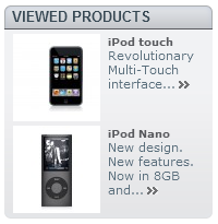
Only displayed when the customer has viewed at least one product during the current session.
This block serves as a reminder of the products previously took interest in, and gives a shortcut back to these if he wants to pick them in the end.
Manufacturers
The customers Customers can choose to display all the products from a single manufacturer, regardless of their types or prices.
CMS block
This is where PrestaShop lists the default static pages, as created by the shop owner: delivery information, legal notices, T&C, etc. They are not selling points, but their content is important enough that it warrants being always available.
Advertising block
By default, this block features a simple image with a link to PrestaShop's official website. You can change the settings of this block to turn this into an ad for a friend's website or another shop.
The right column
The default theme's right column hardly ever changes in the course of the shopping experience. Its main block is the "Cart," one, where the customer can glance over and see what he has currently chosen to buy currently in his cart and how much he is expected to pay for it allit will cost, and remove unwanted product at the with a click of the mouse.
The "new products" block presents the latest new products, with links to their respective pages.

It also gives a your customers quick access to the current promotions (if any) through the "Specials" block. Finally, the customer customers can locate the closest store by clicking on the "Our stores" blocksblock.
These three blocks are always available, from any page, in the default theme.
The middle
...
column
This is where the magic happens. The middle section changes constantly in response to adapt to the customer's choices.
The front page
The default front page gives the customer a broad overview of the shop and its possibilities. An image and a welcome text serve as introduction to the shop.
...
These are followed by the "Featured products" block, presenting 4 of the products that the shop owner chose chooses to highlight, either for their novelty or their current price.
...
Most seasoned web surfers will directly enter visit a shop via a search engine, landing directly on a product of or category page. Few stumble upon the home page, and this is why it should be tailored to new users, with a proper presentation.
Product listing pages
Categories, tags, manufacturers, search, specials, best sellers or new products: ; PrestaShop has many paths to a product, but in the end the customers is are given a familiar listing of products, within the chosen context.
...
Despite the differing content, these listings this listing designs are very similar, so as in order to keep it familiar to even for the newcomers:
- Thumbnail on the left
- Name and description in the middle section
- Price, availability, "Add to cart" button and link to the product's page on the right
...
A click on the "Add to Cart" triggers a quick animation, moving sending the product's thumbnail over to flying into the Cart block.
Image mapping
...
A "+" symbol is placed upon the products which are linked from that image. The image can feature as many links as necessary: in the default demo shop content, the iPod Nanos image-map features 9 links.
Product sorting
Products Product listing by category or manufacturer can be further sorted by price, name or availability.
...
Products within a category can be compared to each other, thanks to each item's "Select to compare" checkbox. This is the only way to compare productproducts, which is logical since there is no sense in comparing product that products which do not have the same characteristics/features.
Indeed, provided Provided the product's information is complete and consistent, the comparison page will display with a row for each comparable feature. This is immensely useful, particularly for products with technical differences.
...
This is where all the information entered by the shop owner is available to the user. Depending on the theme design, a product page can be very thorough, with extension extensive information, or simply present the most essential facts. The default theme is typical in that its most prominent feature is the product images, with a scrolling tool below it.
Next to the image images are two blocks:
- a A "Short description" block, presenting the main facts for the current product in a free form way.
- the The "Add to cart" block, with the possibility option to choose among the available variations (as defined by the shop owner) and the quantity to be ordered.
...
- More info. This is where the customer will find the full description for the product, as entered by the shop owner. The content of this page is free form.
- Data sheet. This is where PrestaShop lists all the detailed featured that were entered in its into database. This data is also the one that is used when comparing two products. Therefore, the content of this tab is very sparsely written: these are just raw facts, far from the free form product description of in the "More info" tab.
The Cart page
Clicking on the "Cart" button from the "Cart" block in the right column, or on the cart symbol in the header, brings the customer to the "Shopping cart summary" page, which is the first step in the order process, as indicated by the breadcrumb trail at the top, indicated indicating the next steps in the order process.
This page gives a succinct but complete view of the items that are in the cart: thumbnail, name, features, availability, price and ability to change the quantity of each product.
A detailed Detailed pricing is then displayed below, comprising including the order's total cost with tax and shipping, and with if the case may be, an indicator applicable, a description of the voucher that was used. Further below, the available addresses are displayed.
...
Because it is one of the main sources of lost customers for online shops, PrestaShop makes it really easy simple and straightforward to create a customer account.
When clicking the "Your account" or "Log in" links, the visitor is taken to the authentication page, where they have to fill one of two forms:
- Create an a new account.
- Log in Login to an existing account.
The first step for a new customer to create his account is to enter his e-mail address in the form and validate. This will bring him to the account creation page itself. Two blocks of information are necessary to fill in order to get an account:
...
Once registered, the customer is redirected to the "My account" page, where he can already see what he has access to: order history, credit slips, vouchers, and access to the previously entered information.
Buying a product
Almost all the pages of an online feature an every page of your store features an "Add to cart" button for a the given product, and display displays a quick summary of the cart cart’s content. This makes it easy for customer customers to take the first step towards an order.
The whole process of buying a product on a PrestaShop site can follow different paths, but they all reach the same conclusion, called the "conversion funnel" in the e-commerce lingo, this is called the “conversion funnel”: from the moment the cart is filled and the customer starts to check it out, it he has to click progress through various validation screens until the order is validated and can be processed.
| Info |
|---|
This is called a conversion funnel because this is where a lot of online shops lose clients because of due to overly long, complicated or numerous screens. Read more on Wikipedia. |
This process starts when the customer clicks on either the cart block's "Check out" button (on any page) or the cart's summary's "Next" button (on the Cart page), and always follows the same sequence of screens:
- (if If the visitor is not logged in) Display the authentication screen, where the visitor can either go to the account creation page , or log inlogin.
- The address-choosing page. Two addresses are necessary for an order:
- The billing address, which should be the one that is tied to the payment method.
- The delivery address, where the order should be sent. If you need to have it sent to another address, untick deselect the "Use the same address for billing" box and either select one an address among the already listed from the previously-added ones, or create a new one.
...
- The shipping page. This is where the customer can choose among a few from different shipping- and packaging- related options. Agree Agreeing to the shop's terms of service is a mustrequirement, but depending on what the shop can offer, the customer may be able to choose a recycled packaging, to gift-wrap the package wrapping (with an optional gift note), and select the carrier a choice of carriers that most suits him.
- The payment page. The customer can choose many payment options, depending on what the shop owner has set up. Cheque Check and credit card /Visa card are the most usualcommon, but PrestaShop makes it easy to offer payment through eBayPayPal, Google Checkout Hipay or other 3rd party providers. The customer clicks on the chosen method and depending on the method, is either sent over to the chosen 3rd third-party handler or continues to one of PrestaShop's page pages where he can enter the needed details, such as a validation before displaying cheque check or bank - wire information.
- Once the customer has validated everything, he reaches the summary page, which begins with "Your order on (name of the shop) is complete". Depending on the chosen mean method of payment, some final information should be provided to the customer, along with a notification of the that a confirmation e-mail having has been sent and a link to the customer support page. The customer must click on the "I confirm my order" button in order to have it validated
...
On this map, stores are indicated using the shop's logo. A click on that logo brings up a small pop-up reveals the full address and phone number, as well as the opening business hours for the store, as indicated by the shop owner.