Tabla de contenidos
Explorando el front-office
El front-office es lo que los clientes constantemente están viendo mientras navegan por su tienda. Es la interfaz, los productos, las imágenes, las descripciones, todo el proceso de compra, etc .
Como cliente, es todo lo que verá de una tienda durante la experiencia de navegación y compra, desde el inicio hasta la finalización de su visita.
Como propietario de una tienda, debe conocer su front-office como la palma de su mano, no sólo porque se lo debe a sí mismo para conocer su tienda por dentro y por fuera, sino porque necesita entender lo que experimentan sus clientes, el número de páginas y clics que necesitan realizar durante una típica sesión de compra, donde podrían tener algún tipo de problema y ser capaz de proporcionarle soluciones, etc.
El tema por defecto
PrestaShop viene con un tema predeterminado, el cual utiliza distintos tonos de grises bajo un fondo de color blanco. Este diseño simple es intencional, con el fin de poder adaptarse a casi cualquier tipo de negocio: coches, fotografías, antigüedades, ¡y cualquier otro que sea necesario!. Fue diseñado para ser fácil navegable, ergonómico y conforme a las normas. Además es completo, ha sido en gran medida testeado por miles de tiendas y ha demostrado su validez.
Si ha instalado PrestaShop con sus datos de prueba, podrá ver los productos de Apple.
While the shop owner can change the front-office theme at any time, thanks to the wealth of themes that are available on the PrestaShop Addons website (http://addons.prestashop.com/), nos basaremos sólo en el tema por defecto en este capítulo.
Note that we here are describing the default theme with its default settings and modules. Activating other modules, or obviously using another theme, can dramatically change the shopping experience.
Navigating the shop
Whether your customer arrives on the front page by typing the shop web addresses or lands on a sub-page through a search engine, he or she will always have many options to navigate through the catalog.
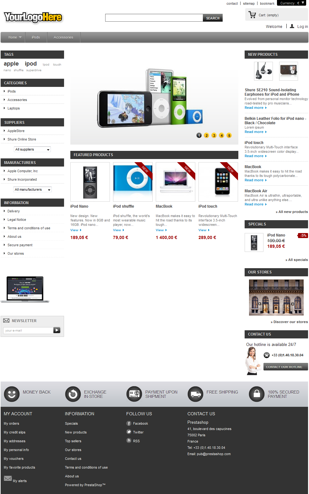
The header
The header is a thin bar of content, accessible from any of the front-office pages.
It contains several essential tools and links, which apply to the whole shop:
- The shop logo. A click on the logo brings the customer back to the front page, from anywhere in the shop. The default logo reads "YourLogoHere": this is an incentive for you to use your own logo rather than keeping the PrestaShop one (as was often the case with the previous default theme).
- The search engine. Many customers prefer to look for a specific item through the search engine rather than browsing through categories after categories of products. On some online shop, this is even the only way to browser the site's content for most customers.
- Contact and Sitemap. These two links take the customer to specific pages, out of the shopping context: contacting the shop administrators, or viewing a complete list of all the pages that are publicly accessible.
- Bookmark. This is not a link per se, but a JavaScript action: when clicked, it will trigger the customer browser to add the shop as a bookmark. The customer can then choose to complete the action or not.
- The currency selector. The customer can choose the currency in which the shop should display prices. This is great in order to compare prices with other international shops.
- Cart: (empty). A quick reminder of the current status of the customer's cart. Sometimes customers select items while browsing and forget about them after a few pages. It is therefore essential to give them a way to keep these products in mind.
- Welcome. A simple welcome message. When the customer is logged in, it becomes "Welcome Firstname", with the customer's first name being a link to his or her customer account.
- Log in. An invitation for the customer to connect to the shop by entering his or her credentials, or to create an account. Once connected, the customers is taken to the "My account" page.
If connected, this will display "Log out".
The header hardly ever changes throughout the whole buying experience.
The cart
The header's essential part is the cart. By default, it is folded in order to only show the number of products it currently contains. The customer can click on the text to access the shopping cart summary, from which the checkout process can be started.
The block's interface changes when the customer puts its mouse cursor over the cart: it opens to display exactly the name of each added product. Each product lines features the quantity, the combination (if any), and the price. The customer can also directly remove unwanted product with a click of the mouse.
The bottom of the block adds the shipping costs and the total price of the order, along with a "Check out" button leading to the shopping cart summary, from which the checkout process can be started.
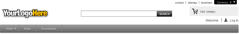
The footer
The footer gives access to pages that could be useful to your users.
- The "My account" block, containing links to the main pages of the user's profile (or the authentication page):
- My orders. All past and currently processing orders.
- My credit slips. Received when an order has been canceled. Credit slips can be used for any future order.
- My addresses. A customer can add multiple addresses for different delivery options.
- My personal info. First name, last name, e-mail address, home address, phone number, date of birth: all the necessary information about a customer.
- My vouchers. All coupons code that have not yet been used.
- My favorite products. The customers can mark products as favorite, for later purchase. They are stored here.
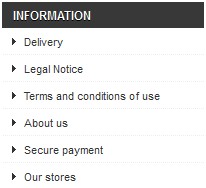
- The "Information" block, containing:
- Three links to products lists:
- Specials. All the current promotions.
- New products. Recently added items.
- Top sellers. Most popular items.
- Four links to informational pages:
- Our stores
- Contact us
- Terms and Conditions
- About us
- Three links to products lists:
- The "Follow Us" block, containing links to your shop's Facebook and Twitter accounts, and a link to your CMS's RSS feed.
- The "Contact Us" block, containing the address, phone number and e-mail address of your business.
Note that all this content can be changed by the shop owner.
The left column
The default theme's left column stays primarily static, as it mainly serves as a handy placeholder for navigation and secondary links.
Tags block
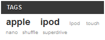
The shop owner can indicate a set of tags for each product. A tag is a non-hierarchical keyword, also described as metadata: it is not displayed on the product page as it does not bring any useful information, but it can prove very useful when building thematic lists – such as a tag-cloud, where the most common tags are written in a bigger font than the rarer ones.
Categories block
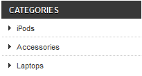
A category is a hierarchical way of sorting items: it can contain any number of sub-categories, making it possible to easily browse from the more general category listings to the more specific products by following a logical path.
A PrestaShop shop can have as many categories and sub-categories as needed, with an infinite number of products in a given category level. All categories are actually sub-categories of the root category, "Home."
This is also the only product list view where the customer can compare products by ticking their checkbox and selecting the "Compare" button.
"Viewed Products" block
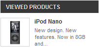
Only displayed when the customer has viewed at least one product during the current session.
This block serves as a reminder of the products previously took interest in, and gives a shortcut back to these if he wants to pick them in the end.
Suppliers block
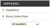
Customers can choose to display all the products from a single supplier, regardless of their types or prices.
Manufacturers block
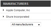
Customers can choose to display all the products from a single manufacturer, regardless of their types or prices.
CMS block
This is where PrestaShop lists the default static pages, as created by the shop owner: delivery information, legal notices, T&C, etc. They are not selling points, but their content is important enough that it warrants being always available.
Advertising block
By default, this block features a simple image with a link to PrestaShop's official website. You can change the settings of this block to turn this into an ad for a friend's website or another shop.
Newsletter block
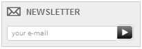
Customers can register to your shop's newsletter directly using this form. Afterwards, the newsletter itself is entirely managed by you; PrestaShop does not handle the transmission of e-mails to the customers.
The "Newsletter" module enables you to generate a .CSV file of all the registered customers and their e-mails, and you should be able to import that CSV file in any e-mailing system.
The right column
The default theme's right column hardly ever changes in the course of the shopping experience.
These blocks are always available, from any page, in the default theme.
New products block
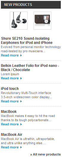
This block presents the latest new products, with links to their respective pages.
Specials block
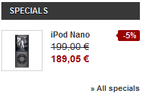
This block gives your customers a quick overview of the current promotions (if any), with the original price and the discount price.
"Our stores" block
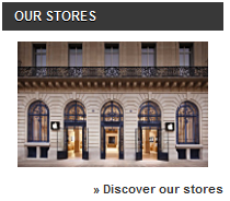
This block contains an image-link to the Store Locator tool, which enables your customers to find the closest physical store. It is essential if your business if you have physical stores, and can be disabled easily if you do not have any.
"Contact us" block
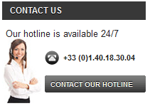
Having your hotline phone number available from every page of your shop is essential.
The central section
This is where the magic happens. The central section changes constantly in response to the customer's choices.
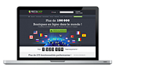
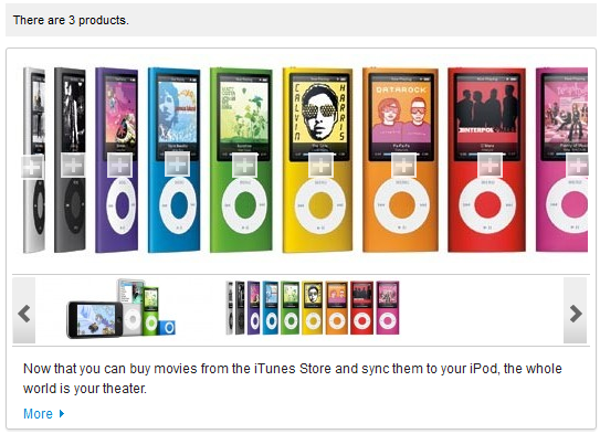
The front page
The default front page gives the customer a broad overview of the shop and its possibilities. An image slider serves as an introduction to the shop.
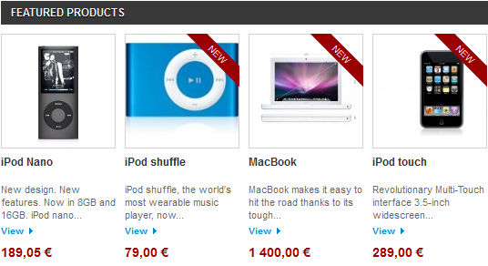
The slider is followed by the "Featured products" block, presenting products that the shop owner chose to highlight, either for their novelty or their current price.
Most seasoned web surfers will visit a shop via a search engine, landing directly on a product or category. Few stumble upon the home page, and this is why it should be tailored to new users.
Product listing pages
Categories, tags, manufacturers, suppliers, search, specials page, best sellers page or new products page: PrestaShop has many paths to a product, but in the end the customers is given a familiar listing of products, within the chosen context.
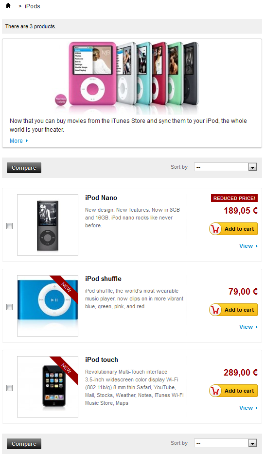
Despite the differing content, this listing designs are very similar, in order to keep it familiar even for the newcomers:
- Main thumbnail on the left.
- Name and description in the central section.
- Price, availability, "Add to cart" button and link to the product's page on the right.
This list view enables the customer to see at a glance the products' main information when they already know everything they need about a product, allowing for a quicker decision process.
A click on the "Add to Cart" triggers a quick animation, sending the product's thumbnail flying into the "Cart" section.
Category header: image and image map
Categories can feature a header image with an introductory message, as set by the shop owner.
While this is not the case by default, you can choose to have the category image replaced by an image map. A category can feature an unlimited number of image maps, which the visitor can scroll through with the tool below it.
An image map is simply an image which has links available for some of its areas. A "+" symbol is placed upon the areas which have links. The image map can feature as many links as necessary.
Product sorting
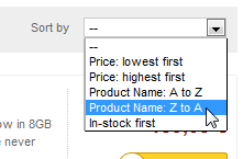
Product listing by category or manufacturer can be further sorted by price, name or availability.
Note that listing by tags does not allow for such sorting.
Product comparison
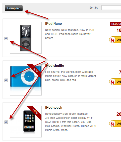
Products within a category can be compared to each other, thanks to each item's checkbox (on the left of the thumbnail). This is the only product listing where the customer can compare products, since there is no sense in comparing products that do not have the same characteristics/features. Obviously, this means that categories should only feature products which can be compared.
Provided the product's information is complete and consistent, the comparison page will display with a row for each comparable feature. This is immensely useful, particularly for products with technical differences.
By default, customers can compare up to 3 products at a time, but this can be changed in the "Products" preference page in the back-office.
Product page
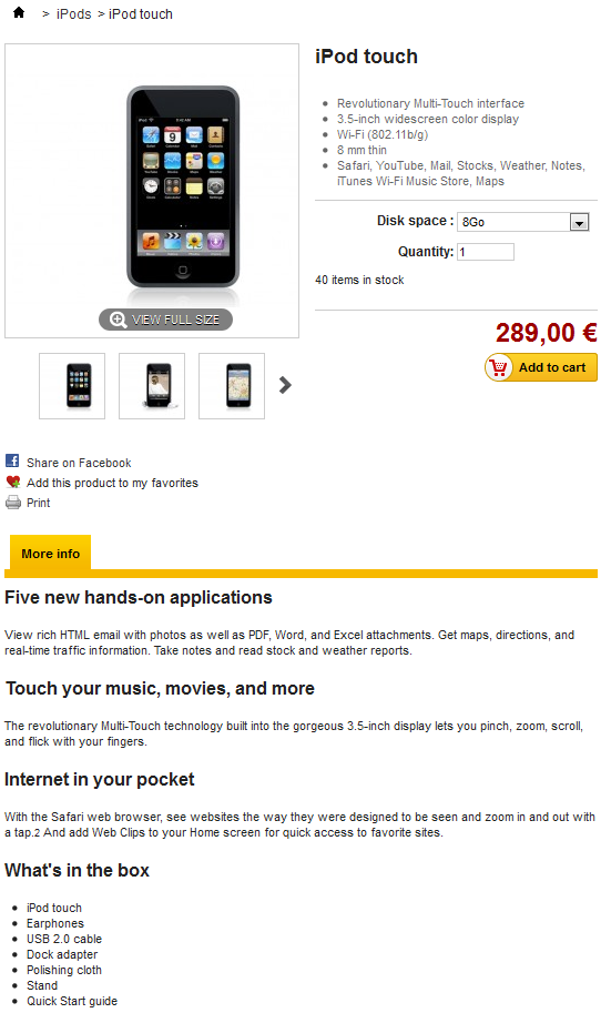
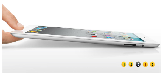
This is where all the information entered by the shop owner is available to the user. Depending on the theme design, a product page can be very thorough, with extensive information, or simply present the most essential facts. The default theme is typical in that its most prominent feature is the product images, with a tool below it enabling customers to scroll between the available images.
Next to the images are two blocks:
- A "Short description" block, presenting the main facts for the current product.
- The "Add to cart" block, with the option to choose among the available combinations (as defined by the shop owner) and the quantity to be ordered.
At the bottom of the product page is a tab section. The most usual ones are:
- More info. This gives the full description for the product, as entered by the shop owner.
- Data sheet. This tab only appears if the shop owner has entered data in the product's "Features" sheet. This gives all the detailed featured that were entered into database. This data is also the one that is used when comparing two products. Therefore, the content of this tab is very sparsely written: these are just raw facts, far from the product description in the "More info" tab.
The cart page
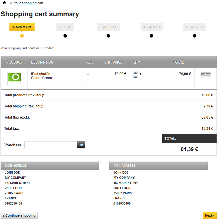
Clicking on the "Cart: XX products" link in the header, or on the "Check out" button in the cart interface also in the header, brings the customer to the "Shopping cart summary" page, which is the first step in the order process. The breadcrumb trail at the top of the page indicates the steps in the order process:
- Summary. Where the customer makes sure that the order only contains the wanted products, no more, no less.
- Login. Where the non-logged customer is asked to log in or create an account. This step is skipped over if the customer is already logged in.
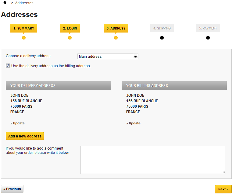
- Address. Where the customer is presented with his or her currently registered addresses in PrestaShop, and has to choose the one where the delivery is to be made.
- Shipping. Where the customer choose the shipping options.
- Payment. Where the customer is presented with the final price of the order (now including the shipping price), and is asked to choose a payment method.
The customer can come back to any previous step by clicking on its title.
The cart page gives a succinct but complete view of the items that are in the cart: thumbnail, name, features, unit price and ability to change the quantity of each product.
Detailed pricing is then displayed below, including the order's total cost with tax and shipping, and if applicable, a description of the voucher that was used. Further below, the available addresses are displayed.
Clicking "Next" starts the check-out process.
Creating a client account
Because it is one of the main sources of lost customers for online shops, PrestaShop makes it simple and straightforward to create a customer account.
When clicking the "Log in" link in the header, the visitor is taken to the authentication page, where he or she has to fill one of two forms:
- Create a new account.
- Log in to an existing account.
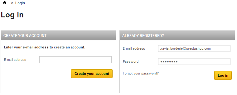
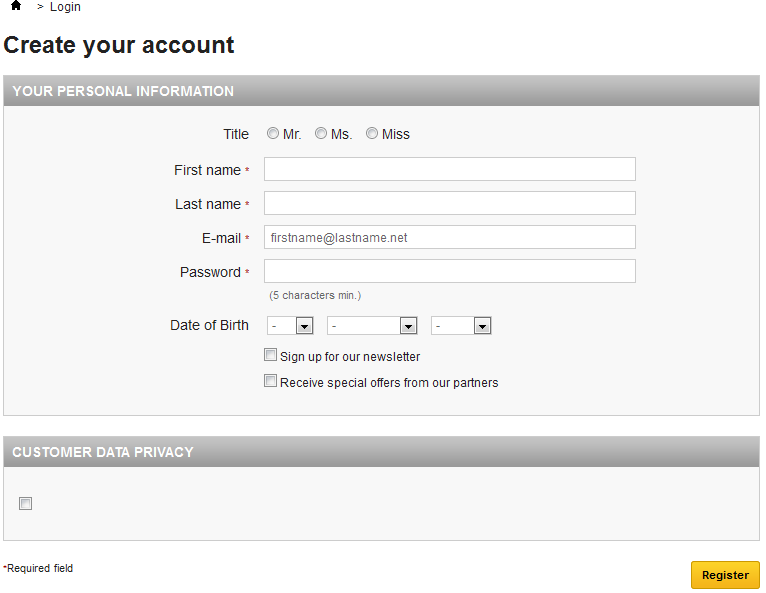
The first step for a new customer to create an account is to enter his or her e-mail address in the form and validate. This will bring up the account creation page itself. Two blocks of information are necessary to fill in order to get an account:
- Your personal information. Everything that can uniquely identify the customer: first name, last name, e-mail (already entered), date of birth.
Customer data privacy. When registering to PrestaShop, the visitor has to agree to your data privacy. It is up to you write it, as it will legally bind you and your customers' data.
Once registered, the customer is redirected to the "My account" page, where many options can be accessed: order history, credit slips, vouchers, and access to the previously entered information.
Buying a product
Almost every page of your shop features an "Add to cart" button for the given product, and displays a quick summary of the cart's content. This makes it easy for customers to take the first step towards an order.
The whole process of buying a product on a PrestaShop site can follow different paths, but they all reach the same conclusion, which in e-commerce lingo is called the "conversion funnel": from the moment the cart is filled and the customer starts to check out, he or she has to progress through various validation screens until the order is validated and can be processed.
This process starts when the customer clicks the cart summary's "Next" button, and always follows the same sequence of screens:
- (if the visitor is not logged in) The authentication screen, where the visitor can either go to the account creation page, or log in.
The delivery address page. If the user account has no registered address, the customer is directly taken to the address creation form.
- The shipping page.
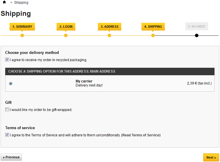
This is where the customer can choose from different shipping- and packaging-related options:- Agreeing to the shop's terms of service is a requirement.
- Depending on what the shop can offer, the customer may be able to choose recycled packaging and gift-wrapping (with an optional gift note)
- The customer MUST choose a carrier in order to reach the next step.
The payment page.
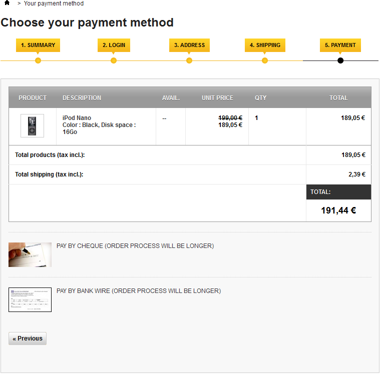
The customer can choose many payment options, depending on what the shop owner has set up. The customer clicks on the chosen method and depending on the method, is either sent over to the chosen third-party handler or continues to one of PrestaShop's pages where he or she can enter the needed details, such as a validation before displaying check or bank wire information.- Once the customer has validated everything, the summary page is displayed.

It begins with "Your order on (name of the shop) is complete". Depending on the chosen method of payment, some final information should be provided to the customer, along with a notification that a confirmation e-mail has been sent and a link to the customer support page. The customer must click on the "I confirm my order" button in order to have it validated
Finding a store
One of the great features of PrestaShop is the ability to get a geolocalized list of all the physical stores to which the online shop is tied. If available (as it is in the demo shop), a click on the "Our stores" block will bring up a map with a search form and radius selector.
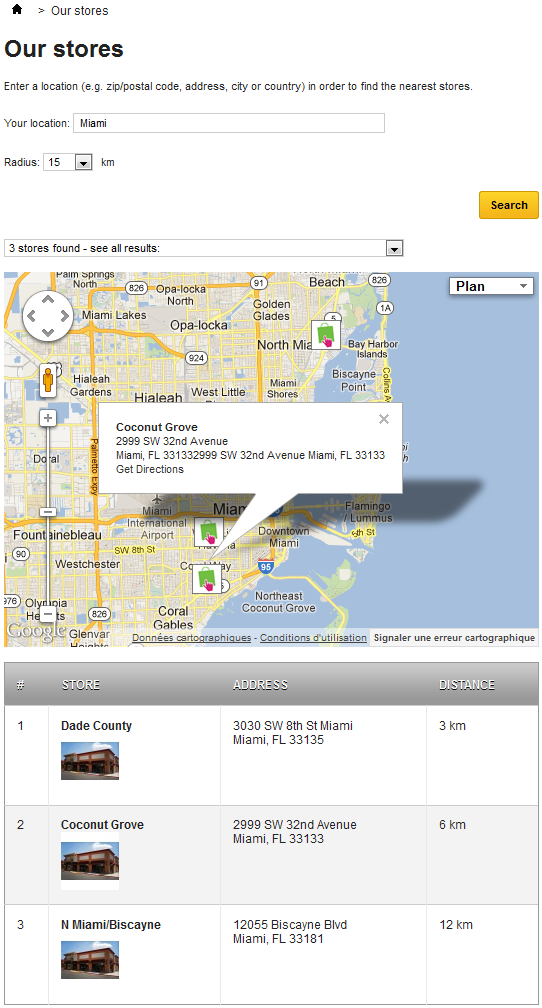
On this map, stores are indicated using the shop's logo. A click on that logo brings up a small pop-up, revealing the full address and phone number, as well as the business hours for the store, as indicated by the shop owner.
At the bottom of the page, a table lists the stores closest to the user's search.