
Tabla de contenidos
Explorando el front-office
El front-office es lo que los clientes constantemente están viendo mientras navegan por su tienda. Es la interfaz, los productos, las imágenes, las descripciones, todo el proceso de compra, etc .
Como cliente, es todo lo que verá de una tienda durante la experiencia de navegación y compra, desde el inicio hasta la finalización de su visita.
Como propietario de una tienda, debe conocer su front-office como la palma de su mano, no sólo porque se lo debe a sí mismo para conocer su tienda por dentro y por fuera, sino porque necesita entender lo que experimentan sus clientes, el número de páginas y clics que necesitan realizar durante una típica sesión de compra, donde podrían tener algún tipo de problema y ser capaz de proporcionarle soluciones, etc.
El tema por defecto
PrestaShop viene con un tema predeterminado, el cual utiliza distintos tonos de grises bajo un fondo de color blanco. Este diseño simple es intencional, con el fin de poder adaptarse a casi cualquier tipo de negocio: coches, fotografías, antigüedades, ¡y cualquier otro que sea necesario!. Fue diseñado para ser fácil navegable, ergonómico y conforme a las normas. Además es completo, ha sido en gran medida testeado por miles de tiendas y ha demostrado su validez.
Si ha instalado PrestaShop con sus datos de prueba, podrá ver los productos de Apple.
Aunque el propietario de la tienda puede cambiar el tema de front-office en cualquier momento, gracias a la gran cantidad de temas disponibles en el sitio web de complementos de PrestaShop,(http://addons.prestashop.com/), en este capítulo nos basaremos tan sólo en el tema por defecto .
Tenga en cuenta que aquí estamos describiendo el tema con su configuración y módulos por defecto . La activación de otros módulos, o evidentemente el uso de otro tema, puede producir un cambio radicalmente distinto en la experiencia de compra.
Navegación por la tienda
Ya sea porque su cliente haya llegado a su página principal, escribiendo la dirección web de la tienda o aterrizando en una sub-página desde un motor de búsqueda, este siempre tendrá diversas opciones para navegar por el catálogo.
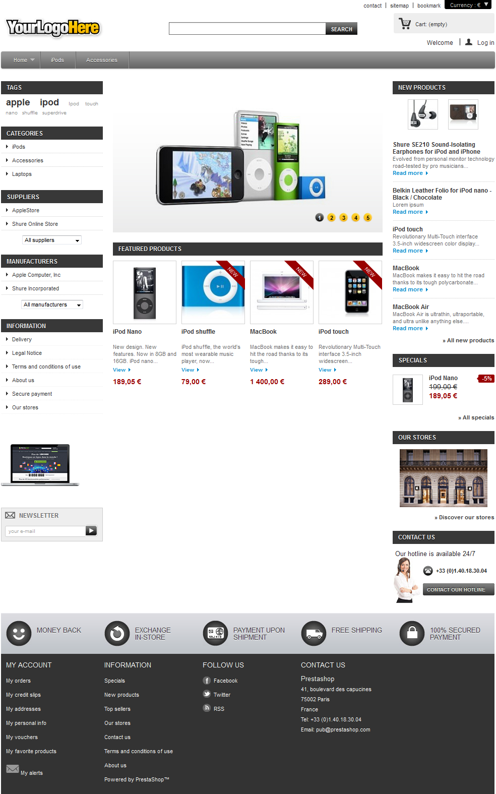
La cabecera
La cabecera es una barra delgada de contenido, accesible desde cualquiera de las paginas del front-office.
Contiene algunas herramientas y enlaces esenciales, que se aplican a la totalidad de la tienda:
- El logo de la tienda. Un clic en el logo traslada al cliente a la página de inicio, desde cualquier lugar de la tienda. El logo por defecto reza "YourLogoHere": esto es un estimulante para que establezca su propio logotipo en lugar de mantener el de Prestashop .
- El motor de búsqueda. Muchos clientes prefieren buscar un artículo específico a través del motor de búsqueda en lugar de navegar a través de todas las categorías de productos. En algunas tiendas en línea, esta es la única manera de navegar por el contenido del sitio para la mayoría de los clientes.
- Contacto y Mapa del sitio. Estos dos enlaces llevan al cliente a páginas específicas, fuera del contexto de compras: contactar con el administrador de la tienda, o ver una lista completa de todas las páginas que están accesibles al público.
- Favoritos. Este no es un enlace per se, sino una acción JavaScript: al hacer clic, esta desencadena que el navegador del cliente trate de añadir la tienda a Favoritos o Marcadores. El cliente eligirá si desea realizar dicha acción o no.
- El selector de moneda. El cliente podrá elegir la moneda en la cual la tienda debe mostrarle los precios . Esto es muy importante para comparar precios con otras tiendas internacionales.
- Carrito: (vacío). Breve recordatorio del estado actual de la compra del cliente. A veces los clientes seleccionan artículos mientras navegan por la tienda y se olvidan de ellos tras algunas páginas. Por lo tanto es fundamental ofrecerles una manera de recordar estos productos.
- Bienvenido. Un mensaje simple de bienvenida. Una vez que un cliente se conecta, se podrá visualizar “Bienvenido, nombre”, siendo el nombre del cliente un enlace hacía su cuenta de cliente.
- Entrar. Una invitación al cliente para que se conecte a la tienda mediante la introducción de sus credenciales, o cree una cuenta. Una vez conectado, el cliente es dirigido a la página "Mi cuenta".
Si está conectado, esto mostrará "Salir".
La cabecera raramente cambia durante el proceso de una compra.
El carrito
La parte importante de la cabecera es el carrito. Por defecto, este se muestra plegado con el fin de mostrar tan sólo el número de productos que actualmente contiene. El cliente puede hacer clic sobre el texto para acceder al resumen del carrito de compras, desde la que puede iniciar el proceso de compra.
La interfaz del bloque cambia cuando el cliente pone el cursor del ratón sobre el carrito : este se despliega para mostrar exactamente el nombre de cada producto añadido. Incluyendo las características del producto como la cantidad, la combinación (si existen), y el precio. El cliente también puede eliminar directamente el producto deseado con un clic del ratón.
La parte inferior del bloque suma los gastos de transporte y el precio total del pedido, junto con un botón de "Confirmar" que redirecciona al Resumen de Productos en Carrito, desde el cual se puede iniciar el proceso de compra.
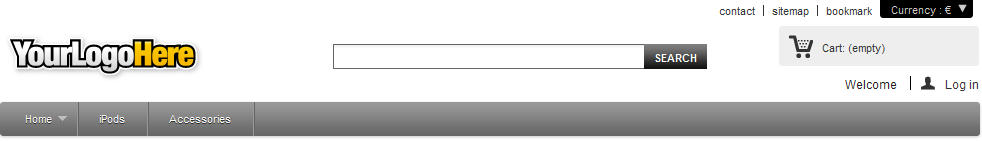
El pie de página
El pie de página da un acceso rápido a páginas que pueden ser útiles para sus usuarios.
- El bloque "Mi Cuenta", contiene enlaces a las páginas principales de perfil del usuario (o la página de autenticación):
- Mis pedidos. Todos los pedidos realizados en el pasado y en la actualidad.
- My credit slips. Received when an order has been canceled. Credit slips can be used for any future order.
- Mis direcciones. Un cliente puede añadir múltiples direcciones para diferentes opciones de entrega.
- Mis datos personales. Nombre, apellidos, dirección de correo electrónico, dirección postal, número de teléfono, fecha de nacimiento: toda la información necesaria acerca de un cliente.
- My vouchers. All coupons code that have not yet been used.
- My favorite products. The customers can mark products as favorite, for later purchase. They are stored here.
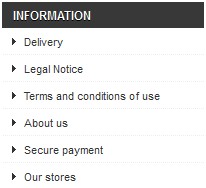
- El bloque "Información", contiene:
- Tres enlaces a listados de productos:
- Promociones especiales. Todas las promociones actuales.
- Novedades. Artículos añadidos recientemente.
- Los más vendidos. Artículos más populares.
- Cuatro enlaces a páginas de información:
- Nuestras tiendas
- Contacte con nosotros
- Términos y Condiciones de uso
- Acerca de
- Tres enlaces a listados de productos:
- El bloque "Síganos", contiene enlaces a las cuentas de Facebook y Twitter de su tienda, y un enlace a su feed RSS.
- El bloque "Contacte con nosotros", contiene la dirección, número de teléfono y dirección de correo electrónico de su empresa.
Tenga en cuenta que todo este contenido puede ser modificado por el dueño de la tienda.
La columna izquierda
La columna izquierda del tema por defecto permanece principalmente estática, ya que tiene como objetivo ser un práctico marcador de navegación y enlaces secundarios.
Bloque Etiquetas
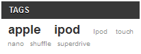
El propietario de la tienda puede indicar un conjunto de etiquetas para cada producto. Una etiqueta es una palabra clave no jerárquica, también definida como metadato: esta no aparece en la página del producto, ya que no aporta ninguna información de interés, pero puede resultar muy útil en la construcción de listas temáticas – como las nube de palabras, donde las etiquetas más comunes se escriben en una fuente más grande que las más inusuales.
Bloque Categorías
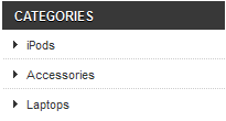
Una categoría es una manera jerárquica de organizar artículos: esta puede contener un número cualquiera de sub-categorías, por lo que esta facilita navegar partiendo desde las categorías más generales a los productos más específicos, siguiendo un camino lógico.
Una tienda PrestaShop puede tener tantas categorías y subcategorías como sea necesario, con un número infinito de productos en cada categoría determinada. Todas las categorías son en realidad sub-categorías de la categoría raíz "Inicio".
Esta es también la única lista de productos donde los clientes puede comparar productos, marcando la casilla de verificación y seleccionando el botón "Comparar".
Bloque Productos más vistos
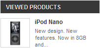
Sólo se muestra cuando el cliente ha visto al menos un producto durante la sesión actual.
Este bloque sirve como un recordatorio de los productos en el que previamente el cliente tuvo interés , proporcionando un acceso directo de nuevo a estos por si él quiere seleccionarlos finalmente.
Bloque Proveedores
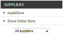
Los clientes pueden optar por mostrar todos los productos de un solo proveedor, independientemente del tipo o precio.
Bloque Marcas (Fabricantes)
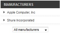
Los clientes pueden optar por mostrar todos los productos de un solo fabricante, independientemente del tipo o precio.
Bloque CMS
Aquí es donde PrestaShop lista las páginas estáticas por defecto, determinadas por el propietario de la tienda: información de entrega, avisos legales, términos y condiciones, etc. No son argumentos de venta, pero sus contenidos son lo suficientemente importantes como para justificar su presencia.
Bloque Publicidad
De forma predeterminada, este bloque presenta una simple imagen con un enlace a la web oficial de PrestaShop. Puede cambiar la configuración de este bloque convirtiendolo en un anuncio para el sitio web de un amigo u otra tienda.
Bloque Newsletter
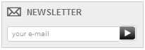
Los clientes pueden registrarse al boletín de noticias de su tienda directamente utilizando este formulario. Posteriormente, este boletín es administrado por el propietario de la tienda; PrestaShop no se encarga del envío de correos electrónicos a los clientes.
El módulo "Newsletter" le permite generar un archivo .CSV de todos los clientes registrados y sus direcciones de correo electrónico, y el propietario de la tienda debería ser capaz de importar ese archivo CSV en cualquier sistema de envíos de mailing.
La columna derecha
La columna derecha del tema por defecto casi nunca cambia en el transcurso de la experiencia de compra.
Estos bloques están siempre disponibles, desde cualquier página, en el tema por defecto.
Bloque Novedades
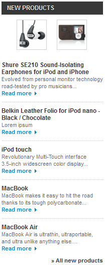
Este bloque presenta los nuevos productos introducidos en la tienda , con enlaces a sus respectivas páginas.
Bloque Promociones Especiales
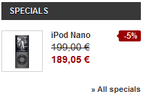
Este bloque ofrece a sus clientes una visión rápida y general de las promociones actuales (si existen), con el precio original y el precio con descuento.
Bloque Nuestras Tiendas
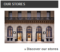
Este bloque contiene una imagen-enlace a la herramienta Localizador de Tiendas, que permite a sus clientes localizar la tienda física más cercana. Es ideal si su negocio dispone de tienda física, y se puede desactivar fácilmente si no tiene ninguna.
Bloque Contacte con nosotros
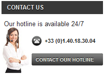
Tener visible el número de teléfono de línea directa disponible en cada página de su tienda es esencial.
La sección central
Aquí es donde se produce la magia. La sección media cambia constantemente para adaptarse a las elecciones de los clientes.
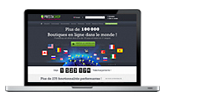
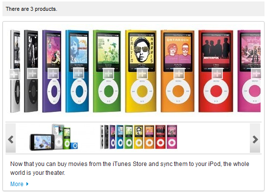
La Portada
La portada ofrece una amplia visión de la tienda y sus posibilidades. Un carrusel de imágenes sirve como una presentación de la tienda.
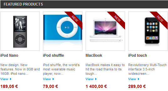
El carrusel de imágenes viene seguido del bloque de “Productos Destacados”, presentando productos que el propietario de la tienda desea resaltar, ya sean por ser novedosos o por descuentos en sus precio.
La mayoría de los navegantes llegarán a la tienda a través de un buscador, entrando directamente en un producto o categoría. Algunos lo harán a través de la página de inicio, y este es el motivo por el cual esta tiene que estar confeccionada para nuevos usuarios, con una presentación adecuada.
Páginas del listado de productos
Categorías, etiquetas, marcas, búsquedas, promociones, mejores ventas o nuevos productos: PrestaShop tiene muchos caminos hacia un producto, pero al final se les dará a los clientes
una lista conocida de los productos, en el contexto elegido.
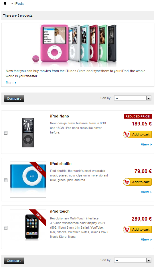
Pese a la diferencia de contenido, estos diseños de listas son muy similares para mantener la familiaridad del contenido incluso para los usuarios recién llegados:
- Miniatura de imagen a la izquierda.
- Nombre y descripción en la sección central.
- Precio, disponibilidad, botón "Añadir al carrito" y un enlace a la página del producto en la derecha.
Esta presentación de la lista permite a los clientes observar de forma resumida la información principal del producto cuando ya conocen lo necesario sobre el producto, permitiendo un proceso de decisión acelerado.
Al hacer clic en "Añadir al carrito" se desencadena una rápida animación, que envía en vuelo a la miniatura de la imagen hacía la sección "Carrito".
Encabezado de la Categoría: imagen y mapeo de imagen
Categories can feature a header image with an introductory message, as set by the shop owner.
While this is not the case by default, you can choose to have the category image replaced by an image map. A category can feature an unlimited number of image maps, which the visitor can scroll through with the tool below it.
An image map is simply an image which has links available for some of its areas. A "+" symbol is placed upon the areas which have links. The image map can feature as many links as necessary.
Product sorting
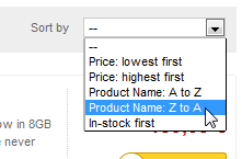
Product listing by category or manufacturer can be further sorted by price, name or availability.
Note that listing by tags does not allow for such sorting.
Product comparison
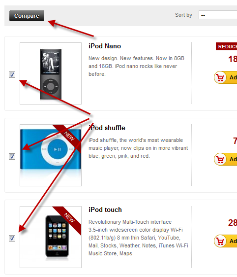
Products within a category can be compared to each other, thanks to each item's checkbox (on the left of the thumbnail). This is the only product listing where the customer can compare products, since there is no sense in comparing products that do not have the same characteristics/features. Obviously, this means that categories should only feature products which can be compared.
Provided the product's information is complete and consistent, the comparison page will display with a row for each comparable feature. This is immensely useful, particularly for products with technical differences.
By default, customers can compare up to 3 products at a time, but this can be changed in the "Products" preference page in the back-office.
Product page
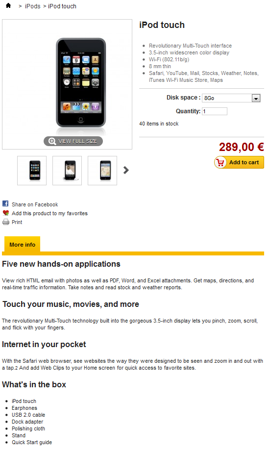
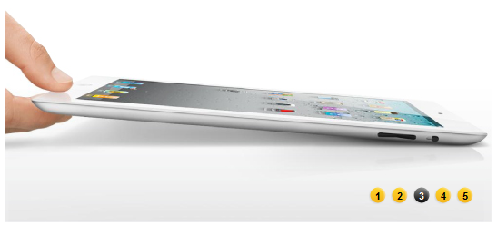
This is where all the information entered by the shop owner is available to the user. Depending on the theme design, a product page can be very thorough, with extensive information, or simply present the most essential facts. The default theme is typical in that its most prominent feature is the product images, with a tool below it enabling customers to scroll between the available images.
Next to the images are two blocks:
- A "Short description" block, presenting the main facts for the current product.
- The "Add to cart" block, with the option to choose among the available combinations (as defined by the shop owner) and the quantity to be ordered.
At the bottom of the product page is a tab section. The most usual ones are:
- More info. This gives the full description for the product, as entered by the shop owner.
- Data sheet. This tab only appears if the shop owner has entered data in the product's "Features" sheet. This gives all the detailed featured that were entered into database. This data is also the one that is used when comparing two products. Therefore, the content of this tab is very sparsely written: these are just raw facts, far from the product description in the "More info" tab.
The cart page
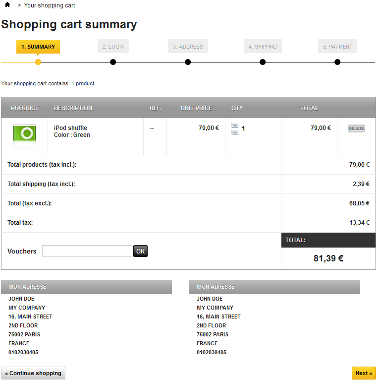
Clicking on the "Cart: XX products" link in the header, or on the "Check out" button in the cart interface also in the header, brings the customer to the "Shopping cart summary" page, which is the first step in the order process. The breadcrumb trail at the top of the page indicates the steps in the order process:
- Summary. Where the customer makes sure that the order only contains the wanted products, no more, no less.
- Login. Where the non-logged customer is asked to log in or create an account. This step is skipped over if the customer is already logged in.
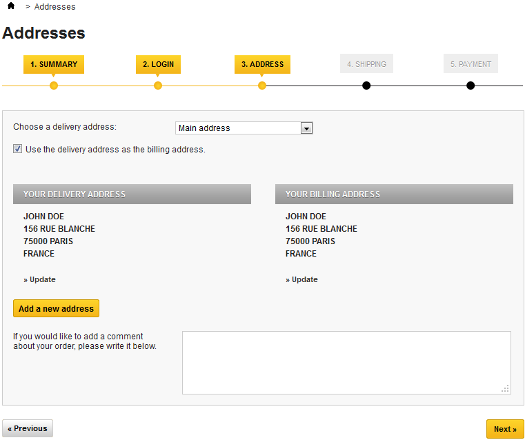
- Address. Where the customer is presented with his or her currently registered addresses in PrestaShop, and has to choose the one where the delivery is to be made.
- Shipping. Where the customer choose the shipping options.
- Payment. Where the customer is presented with the final price of the order (now including the shipping price), and is asked to choose a payment method.
The customer can come back to any previous step by clicking on its title.
The cart page gives a succinct but complete view of the items that are in the cart: thumbnail, name, features, unit price and ability to change the quantity of each product.
Detailed pricing is then displayed below, including the order's total cost with tax and shipping, and if applicable, a description of the voucher that was used. Further below, the available addresses are displayed.
Clicking "Next" starts the check-out process.
Creating a client account
Because it is one of the main sources of lost customers for online shops, PrestaShop makes it simple and straightforward to create a customer account.
When clicking the "Log in" link in the header, the visitor is taken to the authentication page, where he or she has to fill one of two forms:
- Create a new account.
- Log in to an existing account.
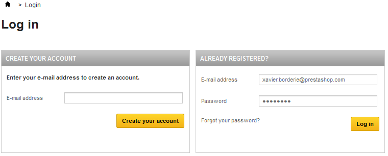
The first step for a new customer to create an account is to enter his or her e-mail address in the form and validate. This will bring up the account creation page itself. Two blocks of information are necessary to fill in order to get an account:
- Your personal information. Everything that can uniquely identify the customer: first name, last name, e-mail (already entered), date of birth.
Customer data privacy. When registering to PrestaShop, the visitor has to agree to your data privacy. It is up to you write it, as it will legally bind you and your customers' data.
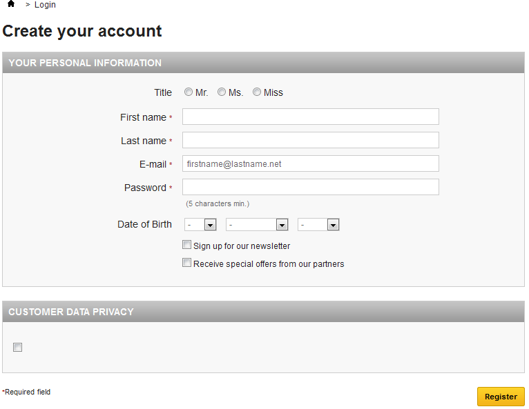
Once registered, the customer is redirected to the "My account" page, where many options can be accessed: order history, credit slips, vouchers, and access to the previously entered information.
Buying a product
Almost every page of your shop features an "Add to cart" button for the given product, and displays a quick summary of the cart's content. This makes it easy for customers to take the first step towards an order.
The whole process of buying a product on a PrestaShop site can follow different paths, but they all reach the same conclusion, which in e-commerce lingo is called the "conversion funnel": from the moment the cart is filled and the customer starts to check out, he or she has to progress through various validation screens until the order is validated and can be processed.
This process starts when the customer clicks the cart summary's "Next" button, and always follows the same sequence of screens:
- (if the visitor is not logged in) The authentication screen, where the visitor can either go to the account creation page, or log in.
The delivery address page. If the user account has no registered address, the customer is directly taken to the address creation form.
- The shipping page.
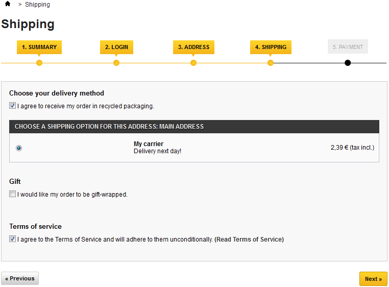
This is where the customer can choose from different shipping- and packaging-related options:- Agreeing to the shop's terms of service is a requirement.
- Depending on what the shop can offer, the customer may be able to choose recycled packaging and gift-wrapping (with an optional gift note)
- The customer MUST choose a carrier in order to reach the next step.
The payment page.
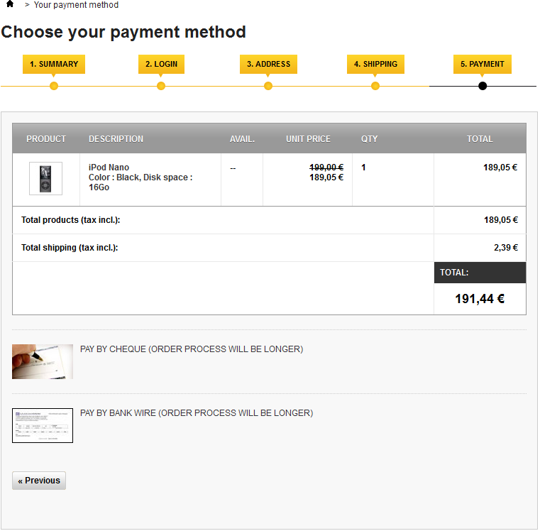
The customer can choose many payment options, depending on what the shop owner has set up. The customer clicks on the chosen method and depending on the method, is either sent over to the chosen third-party handler or continues to one of PrestaShop's pages where he or she can enter the needed details, such as a validation before displaying check or bank wire information.- Once the customer has validated everything, the summary page is displayed.

It begins with "Your order on (name of the shop) is complete". Depending on the chosen method of payment, some final information should be provided to the customer, along with a notification that a confirmation e-mail has been sent and a link to the customer support page. The customer must click on the "I confirm my order" button in order to have it validated
Finding a store
One of the great features of PrestaShop is the ability to get a geolocalized list of all the physical stores to which the online shop is tied. If available (as it is in the demo shop), a click on the "Our stores" block will bring up a map with a search form and radius selector.
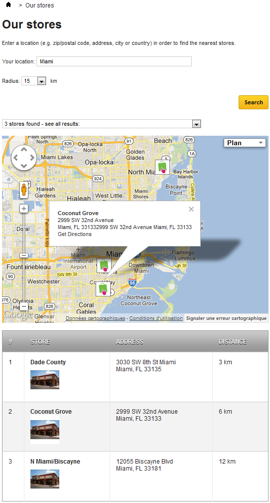
On this map, stores are indicated using the shop's logo. A click on that logo brings up a small pop-up, revealing the full address and phone number, as well as the business hours for the store, as indicated by the shop owner.
At the bottom of the page, a table lists the stores closest to the user's search.