...
- Make sure that you are using PrestaShop 1.4.x, and that you have the latest version of the PayPal module, which is optimized for mobile devices.
- Download the template on PrestaShop Addons: http://addons.prestashop.com/en/mobile-iphone/6165-prestashop-mobile-template.html :
- Connect to the Addons website. If you do not have an account yet, create one, it's free!
- Once you are connected, load the mobile template's Addons page (link above), and click on the "Download" button.

- Your browser will offer to download the
theme_mobile.ziparchive file. Save that file in your computer, for instance on the Desktop. Do not uncompress the archive file.
- Install the template as you would do for a module:
- Connect to the PrestaShop 1.4 administration,
- Go to the "Modules" tab,
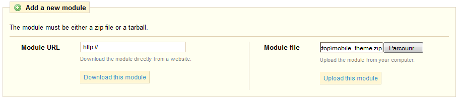
- Click the "Add a module from my computer" link, and in the "Module file" form on the right, choose the template's
mobile_theme.zipfile which you have just downloaded from the Addons website. Click on the "Upload this module" button to put the file online.
- Once the module is online, find it in the list of modules (using the search engine, with the "mobile template" name), and install it by clicking on its "Install" button.
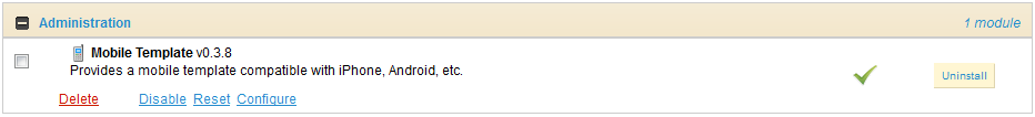
The module is now installed, which means the template is now active on your site, and your clients can already use it. All you have to do know is to customize it.
...
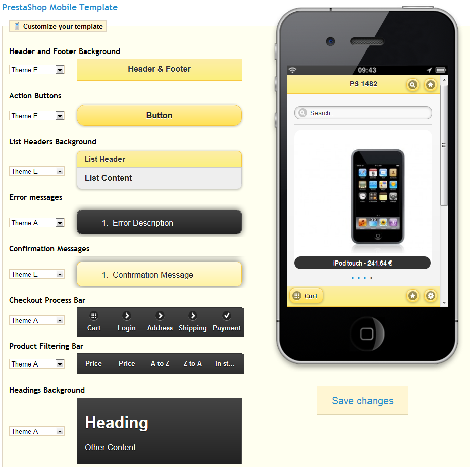
The first section is called "Customize your template". Its 8 options enable you to choose a given theme for each part of the mobile interface. Five themes are available (from A to E), each with its own set of color. You can choose to combine the themes, or to keep a single uniform theme for all the parts of the interface. To see your changes applied to the live preview, click on "Save changes".
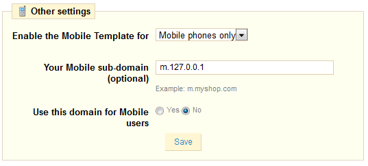
The second section is called "Other settings", and contains three options:
- Enable the Mobile Template for. By default, the mobile template is only displayed when accessing your shop from a mobile phone, tablets getting the same regular template as all other classic devices. This option enables you to choose to also use the mobile template for tablets ("Both" option), or even to only have tablets access the mobile template.
- Your Mobile sub-domain. When the "Use this domain for Mobile users" is enabled, mobile device users are redirected to the
m.your-shop.comsubdomain, thus clearly indicating that it is the mobile version of the main site. You can choose another subdomain. If you prefer your mobile visitors to remain on the main domain, disable the "Use this domain for Mobile users" option below. - Use this domain for Mobile users. When this option is enabled, mobile device users are automatically redirected to the domain listed in the "Your Mobile sub-domain" option above.
Positions
The order in which modules' front-office interface are displayed can be customized – because you might want one module to be place much higher (or lower) in the page that others. In PrestaShop's jargon, this is called "transplanting", and is done using the tool available under the "Positions" sub-tab for the "Modules" tab. In effect, this enables you to attach a module to one of the many available hooks in the current theme, without writing any code.
...